 Passport


Design throughlines: What the artistic style of Tom Morrison (my dad!) taught me
“That’s my dad’s art,” I’ve said countless times, pointing to a framed poster on the wall of a friend’s home or a local business.
“That’s my dad’s art,” I’ve said countless times, pointing to a framed poster on the wall of a friend’s home or a local business.
My dad and me.
“That’s my dad’s art,” I’ve said countless times, pointing to a framed poster on the wall of a friend’s home or a local business.
My dad, Thomas (Tom) Morrison, is the artist behind a popular series of Art Deco prints depicting iconic buildings and well-loved places in Wisconsin. His work is also featured in the PBS Wisconsin Auction, online June 1-10, 2026.
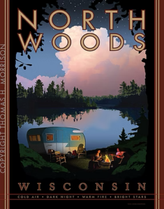
“North Woods” by Thomas H Morrison.
A now-retired graphic designer, he was also my first art teacher. Sometimes the lessons came through direct instruction. He showed me techniques for infusing more life into a portrait I had to draw for a middle school project. When I was heading into the workforce, he gave me tips for polishing the design of my resume. “I’ve got a trick for that,” is one of his catch phrases, always followed by a creative hack for anything from gardening to cleaning up an image in Photoshop.
But I think the indirect lessons have had the most influence on me.
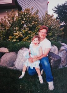
My dad and me, 1990.
He often observes out loud how a design choice can turn into a barrier, like a swirly font on a restaurant menu that’s difficult to read. When creating event flyers, everything from the text and composition to the colors and images plays a role in his design. He’s also a meticulous model railroader, with an eye not just for accurately scaling down objects but for scaling colors and textures to make the scene feel more authentic.
If you think these were all lessons on trying to achieve perfection, my 12-year-old self would agree. But my dad never claims to be a perfect artist (whatever “perfect” even means when it comes to art). What he really instilled in me was an understanding that how you design something – a presentation slide, an illustration of a Wisconsin landmark or even a story about your artist father – impacts people’s ability to access it and what they get from it. Every time he pointed out a billboard cluttered with text, for example, he was showing me how no one could read the message in the short time it took to drive past.
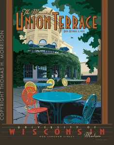
“The Union Terrace” by Thomas H Morrison.
I’m not an art historian, but I see a clear connection between those lessons and my dad’s love of Art Deco. “Every line and every shape. There is a reason for it. So lots of times, you have to throw out half of what you do, because it’s meaningless,” he explained. “There is an elegance to it – the work is deliberate and precise, which appeals to the perfectionist in me,” he added. (My 12-year-old self feels slightly validated.)
“As a graphic designer, I have always been drawn to the aesthetic of the style and its use of typography,” he told me. “I am also fascinated by the impact it had on industrial design.” Many of his interests, from old railroad travel posters to vintage cars to iconic architecture like the Chrysler Building, are distinguished by the bold, streamlined characteristics Art Deco is known for. “I am particularly fond of the beautiful tube radios from the 1930s and ’40s and have quite a collection of them.”
His interest in becoming an artist was initially ignited by concert posters for artists like Jefferson Airplane and Cream in the late 1960s. In high school, he took every art class he could, including drawing, painting, jewelry and woodcut.
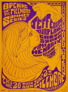
A 1967 poster advertising a concert featuring Jefferson Airplane and Jimi Hendrix.
He went on to earn a degree in commercial art at Madison Area Technical College. An instructor there encouraged him to keep refining his skills. “You know, he always said, ‘Whatever you do, start with a pencil and paper,’” my dad recalled. I laughed. He still starts every project with a pencil and paper.
In the early 2000s, my dad began designing and illustrating Art Deco prints centered around Madison. He was still working as a graphic designer, and the prints were a way to create art just for himself. “Having some of these vintage railroad posters, it’s kind of my inspiration.” He points to artist Leslie Ragan, whose bold, dramatic railroad travel posters invite you to go on an adventure. “I just wanted to create artwork around the iconic Art Deco-style locomotive,” he said. He’s also inspired by the ways artists like Ragan incorporated typography into their work. “I want the fonts to be part of the artwork, just as much as a tree or a car or a building,” he explained. “The typography is just as important. It all has to work together.”
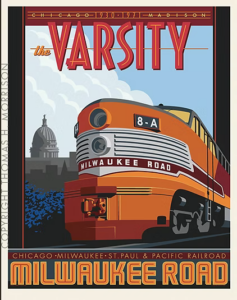
“The Varsity” by Thomas H Morrison.
The first piece in the Madison series, “The Varsity” depicts the Milwaukee Road train that traveled between Madison and Chicago from the 1930s to the early 1970s. The mighty engine eclipses the Madison skyline, invoking the same sense of awe kids feel when they see a real life train up close.
For me, it conjures the smells of oil, grease and old leather that take me back to museum visits and historical train rides my family took throughout my childhood. I think that makes the piece a success.
Bid on signed prints of Tom Morrison’s artwork with framing by U-Frame-It during PBS Wisconsin’s 51st Annual Online Auction, June 1-10. There are thousands of additional items to browse and bid on. Your participation helps fund PBS Wisconsin’s educational programming and community outreach initiatives, while also supporting local businesses across Wisconsin and the Midwest.
Visit Tom Morrison’s website to see more of his work and order prints.

I would love to get your thoughts, suggestions, and questions in the comments below. Thanks for sharing!


PBS Wisconsin is a service of the Wisconsin Educational Communications Board and the University of Wisconsin-Madison. © 2026 All Rights Reserved.
Carol STOLTZ
I’m a Texan who has lived in Stevens Point and Minocqua. I love Wisconsin with a deep heart love. I’m back home in Texas now, but I miss Wisconsin and wish you great success with your auction.
Jean Bates
Thank you so much for this post! I was graduated from Preble High in Green Bay in 66. All my interests were ART based! My great art teacher there started an “INDEPENDENT” class that gave me freedom there to leave class and sit in the countryside and use any medium I chose, all my “art department” experiences after that (Fort Howard Paper company, Milwaukee Journal Sentinal, Santa Rosa CA Press Democrat, Daily News Green Bay, and many others is a small list of occupations) and still involved!
And the sample poster of the Jefferson Airplane/Jimi Hendrix Concert struck a note since my husband and I attended it on his last stint during Military Service in San Francisco area in the late 60’s!
Than you and THANK YOU!